
Pie Chart Calculator
A pie chart shows how parts make up a whole. Enter your categories and numbers and this calculator works out each slice’s percentage and angle, draws a labelled pie or donut chart, and lets you download it — plus the step-by-step working for homework or reports.
- Free to use
- No sign-up
- Runs in your browser
Pie chart calculator
Pie Chart Practice Pack
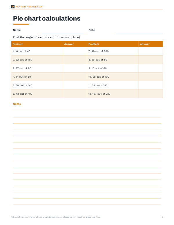
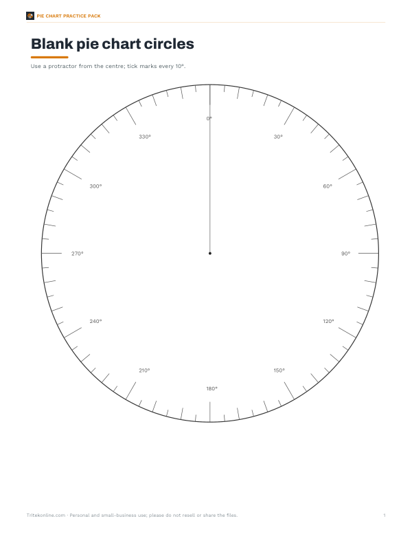
Excel pie chart calculator template, printable pie chart worksheets (percent to degrees and reading pie charts) with answer keys, blank pie chart circles with degree marks and a data collection sheet.
- Calculator (XLSX)
- Worksheet (PDF/DOCX)
- Blank circles (PDF)
- Data sheet (PDF/DOCX/XLSX)
Formats: XLSX, PDF, DOCX. Instant download after payment (link valid 72 hours, up to 5 downloads). AI-assisted: the templates were drafted with AI help and reviewed and laid out before publishing.
$3.00 USD, one-time 4 files · about $0.75 each
- Instant download
- 7-day refund
- Secure checkout by Stripe
7-day money-back guarantee. Full refund within 7 days of purchase, even after you download.
Free sample: Blank Pie Circles (PDF, 49 KB)
Full refund within 7 days — see the refund policy and license.
Free printables
Single sheets you can print right now, no sign-up. The full pack adds every sheet in one download plus the editable files.
 Printable Pie Chart Data Sheet
How to calculate a pie chart
- Add up all the values to get the total.
- For each category, divide its value by the total.
- Multiply by 100 to get its percentage.
- Multiply by 360 to get the angle of its slice in degrees.
- Draw each slice with a protractor, starting from a vertical line and going clockwise.
The angles always add up to 360° and the percentages to 100% (allowing for rounding).
Worked example
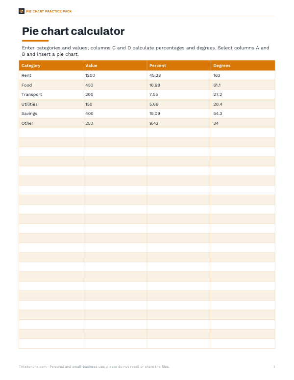
| Category | Value | Percentage | Angle |
|---|---|---|---|
| Rent | $1200 | 45.3% | 163.0° |
| Food | $450 | 17.0% | 61.1° |
| Transport | $200 | 7.5% | 27.2° |
| Utilities | $150 | 5.7% | 20.4° |
| Savings | $400 | 15.1% | 54.3° |
| Other | $250 | 9.4% | 34.0° |
| Total | $2650 | 100% | 360° |
A monthly budget of $2650: rent is 1200 ÷ 2650 = 0.4528 of the total, which is 45.3% and 163.0° of the circle. These are the default values in the calculator.
When to use a pie chart
- The categories are parts of one whole (they add up to 100%).
- There are only a few categories — about six or fewer is easiest to read.
- You want to show that one part dominates, or compare a part with the whole.
- Values are all positive.
When to choose something else
| Situation | Better chart |
|---|---|
| Comparing values across many categories | Bar chart |
| Showing change over time | Line chart |
| Slices of nearly equal size | Bar chart sorted by value |
| Parts of several wholes | Stacked bar chart |
| Values that do not add to a meaningful total | Bar or dot chart |
People judge angles and areas less precisely than lengths, so for close comparisons a bar chart is usually clearer.
Drawing a pie chart by hand
- Draw a circle with a compass and mark the centre.
- Draw a radius straight up from the centre to 12 o’clock.
- Place the protractor’s centre on the circle’s centre, aligned with that radius.
- Measure the first angle clockwise and draw the next radius.
- Move the protractor to the new radius and measure the next angle — or add angles cumulatively from the first line.
- Label each slice or add a key, and check the last slice fills the remaining angle.
Cumulative angles reduce errors: for the worked example, draw lines at 163.0°, 224.2°, 251.3°, 271.7°, 326.0° from the starting line.
Reading a pie chart
To turn a slice back into a number, multiply its percentage by the total: if a survey of 250 people shows 18% chose “walk”, that is 0.18 × 250 = 45 people. To find a percentage from an angle, divide by 360: a 72° slice is 72 ÷ 360 = 20% of the whole. Exam questions often combine the two — measure the angle with a protractor, convert to a fraction of 360, then multiply by the total given in the question.
Common mistakes
- Using values that don’t form a whole, such as scores from different tests.
- Forgetting to multiply by 360 (or by 100) after dividing by the total.
- Rounding angles too early so the slices don’t add to 360°.
- Too many tiny slices that can’t be labelled.
- Using 3-D effects or exploded slices that distort proportions.
Pie vs donut
A donut chart is a pie chart with the centre removed, which leaves room for a total or a label. It reads the same way. Avoid 3-D pie charts: tilting the circle distorts the slices, making front slices look bigger than they are.
Pie charts in spreadsheets
In Excel or Google Sheets, put category names in one column and values in the next, select both and insert a pie chart. The chart calculates the percentages for you; right-click the slices to add data labels showing percentages or values. To match the calculator’s working, add a column with =B2/SUM(B:B) for the fraction and multiply by 360 for degrees — the template pack includes a ready-made version with these formulas.
Pie charts in school maths
| Grade level (typical) | What students do |
|---|---|
| Upper elementary | Read simple pie charts divided into halves, quarters and eighths |
| Middle school | Convert data to percentages and degrees and draw pie charts with a protractor |
| High school statistics | Choose between pie, bar and other charts and critique misleading graphics |
Curricula differ; these are common stages rather than requirements.
Tips for clear pie charts
- Sort slices from largest to smallest, starting at 12 o’clock.
- Combine very small slices into “Other”.
- Label slices directly or with a clear legend.
- Use distinct colours with enough contrast.
- State the total and the date or source of the data.
Privacy
Your data stays in your browser.
Frequently asked questions
How do I convert values to degrees for a pie chart?
Divide each value by the total and multiply by 360.
How do I find the percentage for each slice?
Divide the value by the total and multiply by 100.
Why don’t my percentages add to 100?
Because of rounding; the unrounded values always total 100%.
Can I make a donut chart?
Yes — choose the donut style.
Can I download the chart?
Yes, as SVG or PNG.
Can I enter percentages instead of values?
Yes — percentages work as values, as long as they total 100.
How many degrees is 25% of a pie chart?
90° — a quarter of 360°.
What is 1% of a pie chart in degrees?
3.6°.
Can a pie chart show negative numbers?
No — slices must be positive parts of a whole.
How do I show a pie chart with one very small slice?
Combine small slices into “Other”, or label them outside the chart with a leader line.
What is a donut chart good for?
Showing the total in the centre, or placing two related rings side by side.